You are looking at your website and you want to change one thing: the big text near the top. So you type "make the title bigger" — and the AI changes the browser tab title, or a heading halfway down the page, because "title" can mean several things on a website.
This is the most common friction in conversational website building. It is not that the AI cannot make the change. It is that the parts of a website all have names, and if you have never needed those names before, you end up describing things as "the bit at the top" or "that box thing" and hoping.
You do not need to learn web design. You need about fifteen words. This guide gives you those words, top to bottom, so your next request lands on the first try.
The anatomy of a typical one-page website
Almost every one-page website follows the same top-to-bottom structure. Here is the whole map at a glance:
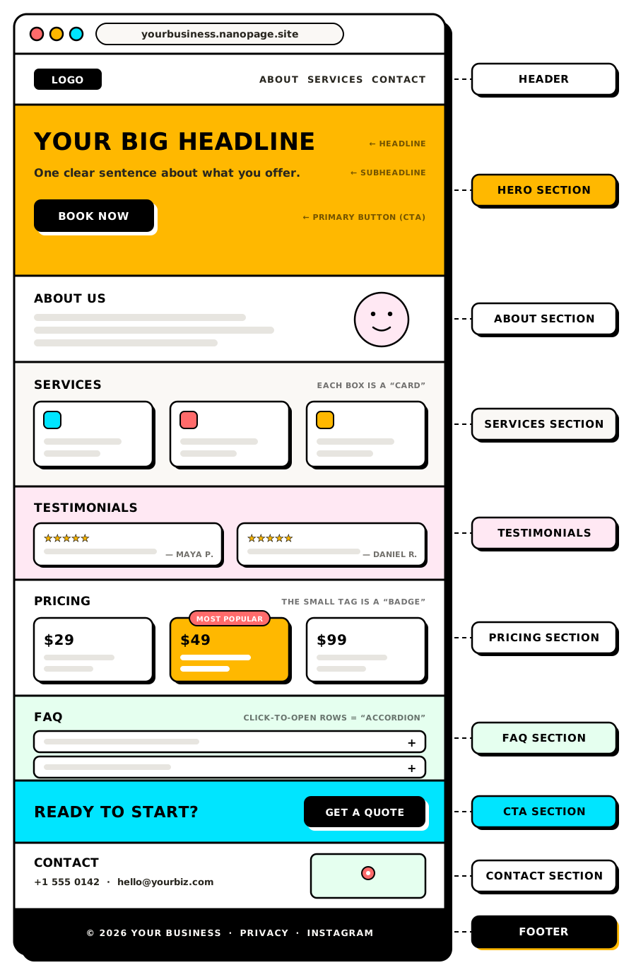
Everything between the header and the footer is made of sections: horizontal bands of content stacked on top of each other, each about one topic. When you scroll a website, you are moving from one section to the next.
That word alone solves half of the naming problem. "The services section", "the reviews section", "the section with the map" — the AI will know exactly where you mean.
Now let's name each part properly.
The header: the strip at the very top
The header is the narrow bar across the very top of the page. It usually contains your logo or business name on the left and a few links on the right. On phones, those links often collapse into the three-line hamburger menu icon.
The links themselves are called the navigation (or "nav"). On a one-page site they typically scroll you down to a section instead of opening a new page. A header that stays visible while you scroll is called a sticky header.
People often say "the menu" when they mean the navigation — which gets confusing if you run a restaurant and your site also has a food menu. Say "navigation" for the links and "menu section" for the food, and both changes come back right.
Example requests:
- "Add a 'Reviews' link to the navigation in the header."
- "Make the header sticky so it stays visible while scrolling."
- "Put the phone number in the header, on the right side."
The hero section: the big opening
The hero section (or just "the hero") is the first large area under the header — the part you see before you scroll. The name comes from old print advertising, where the dominant image was the "hero shot". It is the most important real estate on the page, because many visitors never scroll past it.
A hero usually contains four things, each with its own name:
- The headline: the biggest line of text on the page. One sentence saying what you do or offer.
- The subheadline: the smaller supporting line under the headline, adding one level of detail.
- The hero image: the main photo or illustration. When the image fills the whole area with text on top of it, it is a background image, often dimmed by a dark tint called an overlay so the text stays readable.
- The primary button: the main button you want people to click — "Book a table", "Get a quote", "RSVP".
So instead of "make the title bigger" — which could mean the browser tab, the headline, or any section heading — you can say "make the hero headline bigger" and there is nothing to guess.
Example requests:
- "Change the hero headline to 'Wood-fired pizza in Salem' and make the subheadline mention we deliver."
- "Use the kitchen photo as the hero background image, with a darker overlay."
- "The hero button should say 'See the menu' and scroll to the menu section."
The middle of the page: content sections
Everything between the hero and the footer is content sections. Which ones your site has depends on what it is for, but most come from a short, recurring list. You can name any of them as "the X section".
About section
A few sentences on who you are — your story, your face, your credentials. Often paired with a portrait photo. Sometimes labeled "Our story" or "Meet the team" instead.
Services, features, or menu section
The section listing what you offer: services with prices, product features, dishes, class schedules, or projects in a portfolio. It is usually laid out as a row or grid of cards — more on cards below.
Gallery section
A grid of photos. Some galleries open a larger view when you click a photo (a lightbox), and some scroll sideways through images one at a time (a carousel or slider).
Testimonials section
Quotes from happy customers, usually with a name and sometimes a photo or star rating. Also called reviews or social proof. This is often the section that convinces an undecided visitor, so it is worth keeping fresh.
Pricing section
Prices, packages, or plans — often shown as side-by-side cards so visitors can compare. If one option is marked "Most popular", that marker is a badge.
FAQ section
Frequently asked questions. Often built as an accordion: a stack of questions where clicking one expands the answer and clicking again collapses it. If you want the answers always visible instead, ask for the FAQ "without the accordion, all answers open".
Contact section
Your phone, email, address, hours, and possibly a map. If visitors can type a message directly on the page, that is a contact form, and each box they type into is a field.
Example requests:
- "Add a testimonials section between services and pricing, with these three quotes."
- "In the pricing section, add a 'Most popular' badge to the middle plan."
- "Turn the FAQ into an accordion so the page feels shorter."
The CTA: the button with a job
CTA stands for call to action — the thing you most want a visitor to do, usually shaped as a button: "Book now", "Get a quote", "Download the PDF", "RSVP".
Two related terms are worth knowing:
- The primary CTA is the main action, styled to stand out — usually a solid, colored button.
- A secondary CTA is the quieter alternative next to it — often an outlined or plain-text button like "or see our work first".
Many pages also end with a CTA section: a short, full-width band near the bottom that repeats the main ask one last time ("Ready to book? Call us today"), so a visitor who read all the way down does not have to scroll back up to act.
Example requests:
- "Make the primary CTA 'Get a free quote' everywhere it appears."
- "Add a CTA section before the footer: 'Spots fill up fast — book your session' with the booking button."
- "Add a secondary CTA in the hero that scrolls to the gallery."
The footer: the small print at the bottom
The footer is the strip at the very bottom of the page — typically on a darker background, in smaller text. It usually holds the business name, copyright line, contact details, social media links, and links to pages like the privacy policy.
Visitors rarely study the footer, but they do use it as a fallback: when someone cannot find your phone number, the footer is where they look. That makes it a good home for a duplicate of your contact details, even if they already appear in a contact section.
Example requests:
- "Add our Instagram and Facebook links to the footer."
- "Put the full address and phone number in the footer too."
- "Update the copyright year in the footer to 2026."
Smaller elements you will want to name
Sections are the big bands; these are the pieces inside them. A few show up constantly:
- Card: a self-contained box holding one item — one service, one price plan, one testimonial, one team member. Usually shown in rows or grids. "The third card in the services section" is a perfectly precise address.
- Section heading: the title line at the top of each section ("Our Services", "What clients say"). Different from the hero headline, which is the big one at the top of the page.
- Button vs link: a button is the boxed, colored, clickable shape; a link is clickable text, usually underlined or colored, sitting inside a sentence.
- Icon: the small symbol next to text — a phone icon, a checkmark, a star. Not a photo, not the logo.
- Banner: a slim strip of text across the page, often above the header, used for announcements: "Closed Dec 24-26" or "Summer special: 10% off".
- Badge: a small label pinned onto something else — "New", "Sold out", "Most popular".
- Divider: the visual break between sections — a line, a color change, or extra empty space.
- Background: the color or image behind a section's content. "Give the testimonials section a light gray background" changes the backdrop, not the text.
Example requests:
- "Add a banner above the header: 'Holiday hours: closed Dec 24-26'."
- "In the services section, add a fourth card: Gutter cleaning, from £90."
- "Use icons next to each item in the 'What's included' list."
Don't know the word? Describe it three ways
This vocabulary helps, but you never actually need a term you do not know. The AI can find any part of the page if you pin it down another way. Three techniques work reliably:
- Locate it by position. "The section right under the big photo at the top", "the last section before the bottom strip", "the second section from the top". Counting works.
- Quote the text. The most precise address on any page is its own words: "the part that says 'Over 200 happy customers'", "the button that says 'Send'". If you can quote it, the AI can find it — exactly.
- Describe the content. "The section with the three price boxes", "the row of customer quotes", "the grid of photos". Describing what is in it works even when you cannot see the page while typing.
And when you know what bothers you but not what to call the fix, describe the outcome instead of the mechanism: "the top of the page feels cramped" or "make the reviews stand out more" are legitimate requests. As covered in How to Update Your Website by Just Asking, stating the outcome and letting the builder choose the method usually beats guessing at implementation details.
Putting it together: before and after
Here is the difference this vocabulary makes in practice.
Vague version:
Make the top part better and move the thing with the reviews up.
Also the button should be different.
Precise version:
Three changes:
1. Hero: change the headline to "Family dentistry in Leeds since 2009"
   and use the reception photo as the background image.
2. Move the testimonials section up, directly under the hero.
3. Change the primary CTA to "Book a check-up" — in the hero,
   the CTA section, and the header.
Both take under a minute to type. The second one comes back right the first time, because every instruction names a part and says exactly what happens to it.
The same vocabulary pays off before the site exists at all. A website brief that says "sections to include: hero with the storefront photo, menu highlights, testimonials, hours and location, contact form" gives the AI a floor plan instead of a guess.
The short version
A website is a stack of horizontal sections between a header at the top and a footer at the bottom. The first big section is the hero, holding the headline, subheadline, hero image, and your main button — the CTA. The middle sections — about, services, gallery, testimonials, pricing, FAQ, contact — are each named by what they contain, and the repeated boxes inside them are cards.
When you ask for a change:
- Name the section, then the element: "the headline in the hero", "the second card in the pricing section".
- If you do not know the name, locate it by position, quote its text, or describe its content.
- For fuzzy improvements, describe the outcome you want and let the builder pick the method.
Keep this page open the next time you are editing your site. Fifteen words of vocabulary is the difference between three rounds of "no, the other one" and a change that lands on the first try.